There’s a lot of advice out there on how to get more leads from your website: build an intuitive conversion path, place your form above the fold, make your calls-to-action stand out with contrasting colors, and so on.

But sometimes there are simple optimizations you can make that can have a big impact on your conversion rate that aren’t so obvious.
Here’s a not-so-obvious one: By decreasing the file size of the images on your landing pages, you can increase conversion rates and get more leads.
How does an image’s file size impact lead gen?
It’s pretty simple. If you have a landing page with a 700KB image, the page is going to take longer to load than if you used a 30KB image. When a web page takes a long time to load, this happens:

When someone smashes their computer leaves your landing page instead of converting on your form, you’re missing out on a lead and increasing your bounce rate.
Data that proves that faster page load times increase conversions
For this test, I took ten of the slowest-loading landing pages on HubSpot’s website due to the giant image files we used, and used Google Analytics to compile data from one month before AND one month after optimizing the images on these pages. Here are the results:
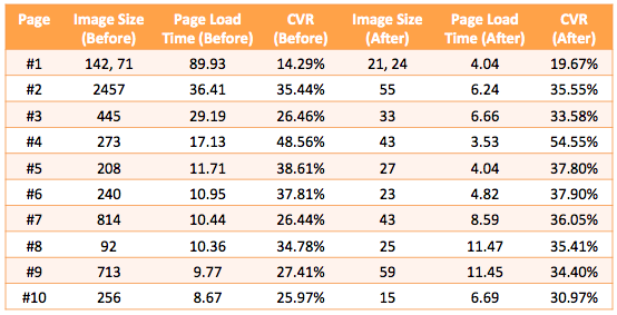
As you can see, the conversion rates increased on every single landing page. The average conversion rate increased 11%, from 31.8% to 35.6%. That’s four extra leads for every 100 visitors that we wouldn’t have gotten before.
The page load time improved on eight of the ten pages. One thing to keep in mind is a few slowpokes can skew the data significantly. If five of our visitors had wildly slow internet connections, for example, it could make the page load times look worse than it was for most of our visitors. There are some elements out of your control. But as you can see, the overall trends show a decrease in page load speed and an increase in conversion rates.
How can you optimize your image’s file size?
The best way to decrease your image’s file size while maintaining the image’s visual aesthetics (e.g. not make it look like a pixelated mess) is to use Photoshop. I know that many of you won’t have Photoshop, so below these instructions I’ll link to some alternate solutions.
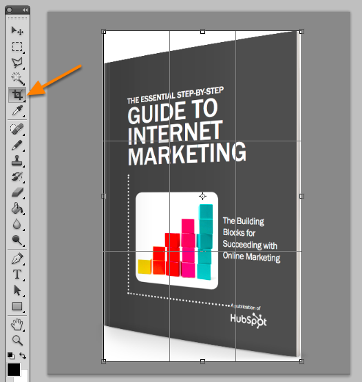
1) Crop out all white space around your image.
You don’t need all that extra space. You can use HTML/CSS to add extra padding around the image on your landing page. In Photoshop, use the crop tool to eliminate extra white space.
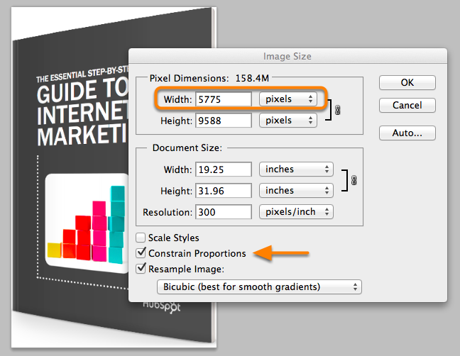
2) Make the image as small as it needs to appear on the screen.
By default, your high-def image may be 2,000 pixels wide. That’s way too big. On most landing pages, your ebook image will appear as no more than 300 pixels wide. In Photoshop, click Image > Image Size > edit the width. Input a smaller width, such as 300. Make sure “Constrain Proportions” is checked before editing the width.
3) Make the image transparent.
Delete the white background behind your image. Sometimes it’s as simple as deleting the white background layer.
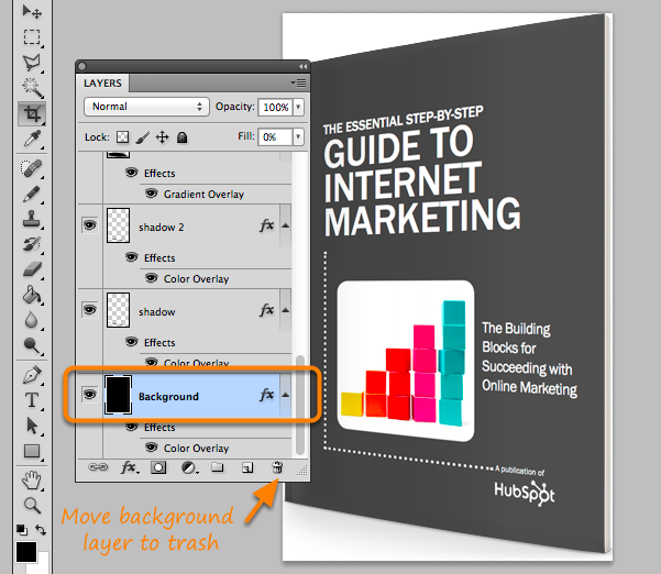
Other times it’s more complicated. If your image has only a single layer, right click on that layer and click Layer from Background.
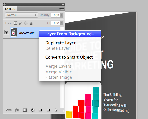
Then use the magic wand, polygonal lasso, or quick selection tool to select the white background. Once the white background is selected, delete it. You’ll then have a transparent image.
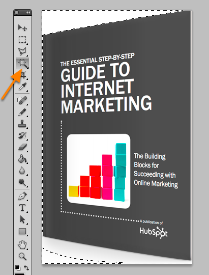
4) Save the image as a PNG-8 file.
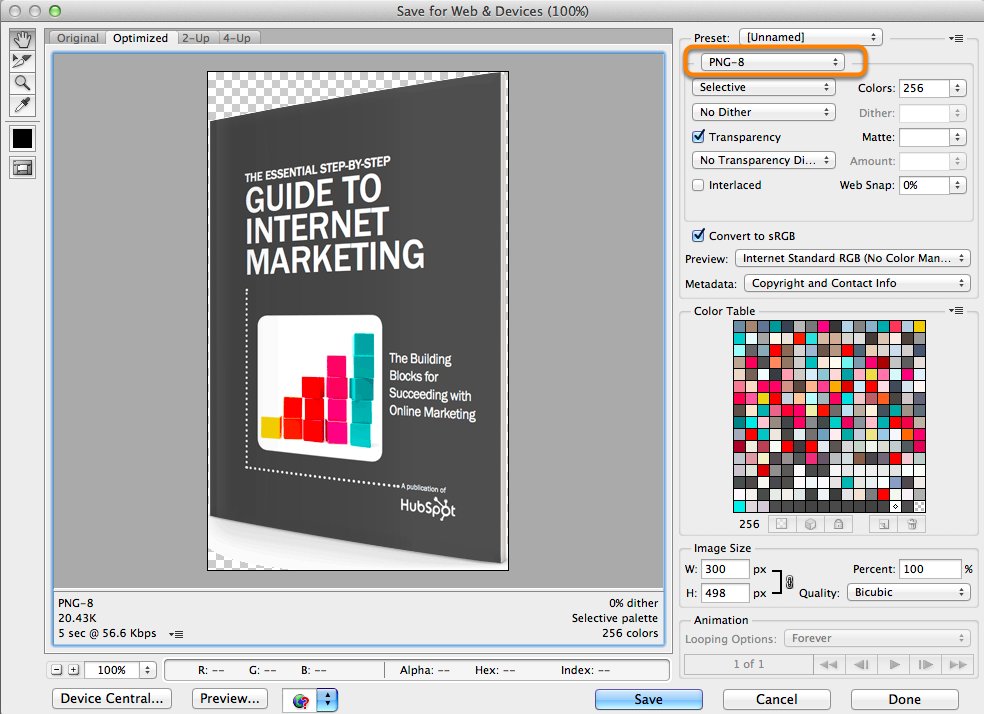
Now save the image in the smallest file size possible without compromising the visual quality of the image. In Photoshop, click File > Save for Web. Then select PNG-8 and click Save. Here are my settings:
Alternate Methods of Optimizing Image Size
If you don’t have Photoshop, there are other ways to reduce your image size, but you may lose control over the quality of the image. Here are some resources you can use:
- Image Optimizer – another free online image optimizer
- PowerPoint – You can also use PPT to compress images. Here is the official documentation.


Leave a Reply